How to Add Texture Grain Effects to Digital Posters 2025: Bringing Human Touch to AI-Generated Designs

Introduction: The Rise of Textured Grain in Digital Design
In an era where AI-generated imagery dominates the digital landscape with its perfect, sometimes too-perfect visuals, there's a growing desire to bring back the human touch. One of the most effective techniques for doing this is adding texture grain effects to digital posters and designs. This subtle yet powerful approach can transform sterile, computer-generated graphics into artwork that feels organic, tangible, and uniquely human.
In this comprehensive guide, we'll explore how to add textured grain posters to your creative arsenal using Lovart, a cutting-edge AI design agent that's revolutionizing how we approach digital creation. Whether you're a seasoned designer or just starting out, you'll discover practical steps to elevate your designs with texture, depth, and that elusive human quality that connects with viewers on a deeper level.
Let's dive into the world of grain effects and learn how to bring that perfect imperfection to your AI-generated designs.
Why Textured Grain Matters in 2025: Beyond the Perfect Pixel
Before we jump into the how-to, it's worth understanding why textured grain has become such a dominant trend in digital design. In a world where AI can generate flawless imagery in seconds, the distinctive marks of human creation—subtle imperfections, texture, and tactile qualities—have become increasingly valuable.
Here's why adding texture grain to digital poster designs matters now more than ever:
- Countering Digital Sterility: AI-generated images can sometimes feel too perfect, lacking the soul and character that comes from human intervention. Textured grain counteracts this sterility.
- Creating Emotional Connection: Grain effects tap into our nostalgic associations with analog media like film photography, vinyl records, and print materials, creating immediate emotional resonance.
- Adding Perceived Value: Studies show that consumers often perceive textured designs as more premium and authentic than their ultra-clean counterparts.
- Establishing Brand Differentiation: In an oversaturated digital space, textured grain can help your visual communications stand out from competitors still embracing the "digital perfect" aesthetic.
- Enhancing Visual Hierarchy: Strategic use of grain can direct attention, create depth, and improve the overall visual structure of your designs.
According to the 2025 Design Trends Report, "Textured grains have evolved from a simple overlay effect to a sophisticated design element that adds depth and emotion to digital creations. The trend has moved beyond just applying film grain effects to embracing intentional, strategic use of texture to make otherwise flat 2D digital art feel more tangible."
Now that we understand the why, let's explore how to leverage Lovart's powerful capabilities to add textured grain to your digital poster designs with intention and skill.
Understanding Texture Types: Choosing the Right Grain for Your Design
Before diving into the practical steps of how to add textured grain to digital poster designs, it's important to understand the different texture types available and when to use them. Each grain style creates a distinct mood and serves different design objectives.
Here's a breakdown of the most common texture types you can apply in Lovart:
| Grain Type | Characteristics | Best Used For | Emotional Effect |
|---|---|---|---|
| Film Grain | Random, organic noise pattern; mimics analog photography | Photography-based posters, retro designs, emotional storytelling | Nostalgia, authenticity, warmth |
| Halftone | Regular pattern of dots of varying sizes | Comic-inspired designs, pop art, bold statements | Energy, dynamism, vintage appeal |
| Noise Grain | Subtle, digital noise with randomized pixels | Modern designs, tech products, minimal aesthetics | Sophistication, contemporary feel |
| Paper Texture | Simulates the feel of physical paper with subtle imperfections | Editorial designs, book covers, elegant branding | Tactile quality, credibility, premium feel |
| Grunge Texture | Heavy, distressed appearance with scratches and marks | Alternative music posters, urban themes, edgy branding | Rebellion, authenticity, raw emotion |
| Risograph Grain | Distinctive duotone look with slight misalignments | Artistic posters, independent publications, creative projects | Artisanal quality, DIY aesthetic, uniqueness |
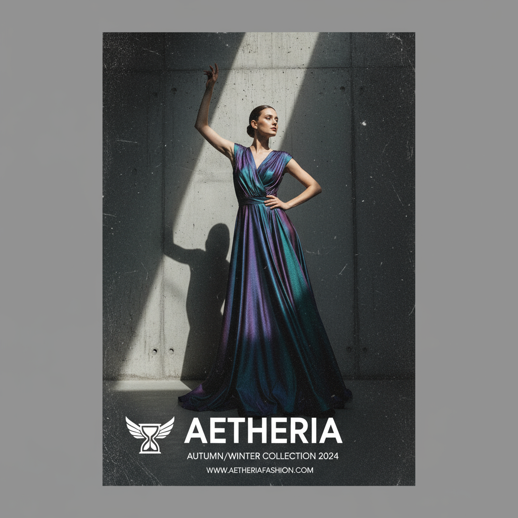
When selecting the appropriate grain texture for your project, consider both your brand identity and the specific message you're trying to convey. For example, a luxury fashion brand might benefit from subtle film grain that adds sophistication without overwhelming the design, while an independent music festival poster might embrace heavier grunge textures to communicate raw energy.
Remember that how to add textured grain posters effectively isn't just about applying an effect—it's about choosing the right texture that enhances your message rather than distracting from it.
Step-by-Step Guide: Adding Texture Grain in Lovart
Now let's dive into the practical steps of how to add textured grain to digital poster designs using Lovart. This AI design agent offers powerful tools that make adding organic elements to your work intuitive and efficient.
Step 1: Preparing Your Base Design
Before adding texture, you need a solid foundation:
1.Open Lovart and create a new project by clicking "Design Now" on the homepage.
2.Use the prompt interface to describe your basic poster concept, including:
- Subject matter (e.g., "concert poster," "product advertisement")
- Style direction (e.g., "minimalist," "retro," "bold")
- Color scheme preferences
- Key elements to include (logos, text, imagery)
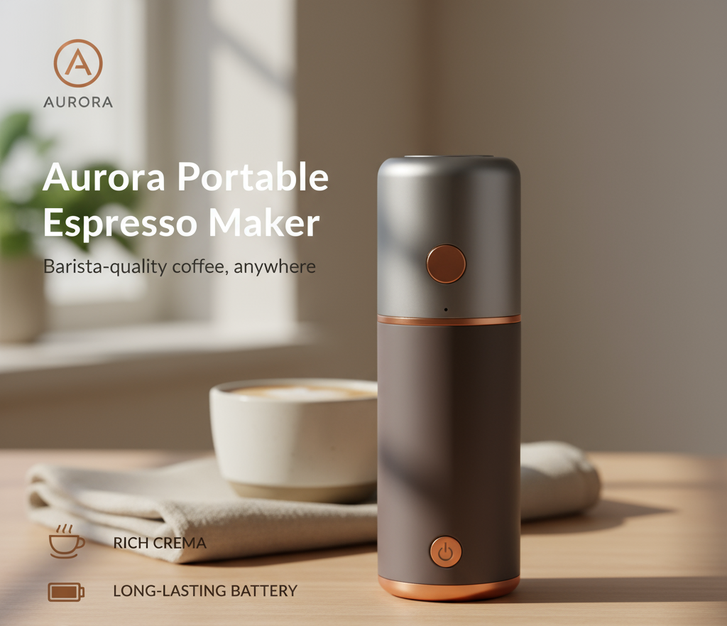
Example Prompt:"Create a poster for: product advertisement (portable espresso maker).Title / main headline: "Aurora Portable Espresso Maker".Style direction: clean modern lifestyle product ad with subtle handcrafted warmth.Color scheme: soft neutrals (warm beige, stone gray) with deep espresso brown accent and small copper highlight.Key elements to include: product hero image centered (high-quality product shot), brand logo top-left, short tagline under title ("Barista-quality coffee, anywhere"), bullet features area (3 icons + short text) near lower-left, price and CTA bottom-right, small QR code for purchase.
3.Review the initial designs generated by Lovart and select the one that best matches your vision as your base.
Pro tip: For optimal texture application later, choose designs with some clean space and strong contrast points where grain can create interesting visual effects.
Step 2: Specifying Texture in Your Prompt
Lovart's strength lies in its understanding of design terminology. To add textured grain posters directly in your generation process:
1.In the ChatCanvas interface, refine your prompt with specific texture requests.
2.Use precise language to describe the texture you want, such as:
- "Add subtle film grain texture for a vintage photography feel"
- "Apply coarse noise grain to create depth and tactile quality"
- "Include light paper texture to give an organic, printed appearance"
3.Specify the intensity using descriptors like "subtle," "moderate," or "pronounced."
4.Indicate if you want the grain applied universally or to specific elements only.
Example prompt: "Create a concert poster for an indie rock band with bold typography and a photograph of a microphone. Apply a moderate film grain texture throughout to give it an authentic, analog feel, with slightly stronger grain in the darker areas."

Step 3: Fine-Tuning Texture Parameters
Lovart allows for detailed texture customization:
1.Once your initial textured design is generated, use the ChatCanvas to make specific adjustments.
2.Type refinement instructions such as:
- "Increase the grain density in the shadows"
- "Make the texture more uniform across the entire poster"
- "Add more contrast to the grain effect"
3.Use the marking tool to circle specific areas where you want texture adjustments.
4.Try variations by asking for "more subtle" or "more pronounced" versions to compare options.

Lovart’s AI understands these nuanced requests and can make precise adjustments to your textured grain effects, allowing for iterative refinement until you achieve your desired look.
Advanced Techniques: Mastering Textured Grain for Different Design Styles
Once you've mastered the basics of how to add textured grain posters in Lovart, you can explore more sophisticated techniques tailored to specific design styles. These advanced approaches will help you create truly distinctive work that stands out even within the growing textured grain trend.
Technique 1: Style-Specific Grain Effects
Different design styles call for different texture approaches:
Vintage/Retro Designs
For authentic vintage looks, grain should be more pronounced and characteristic:
- Specify era-appropriate grain (e.g., "1970s film grain," "VHS texture," "60s magazine halftone")
- Include color shifts and imperfections like light leaks or dust specks
- Layer multiple texture types for authenticity
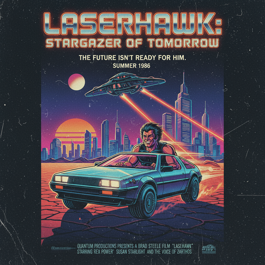
- Example prompt: "Design a retro movie poster with 1980s aesthetics. Include pronounced film grain with slight color shifting toward cyan in the shadows. Add occasional dust specks and subtle scratches for authentic vintage character."
Bold, Expressive Designs
For high-energy, expressive work, texture becomes a dominant element:
- Use high-contrast grain patterns that become part of the visual language
- Experiment with oversized halftones or pixelation effects
- Try directional grain that follows the energy of your composition
- Example prompt: "Create an energetic music festival poster with bold typography and vibrant colors. Apply aggressive grain texture that varies in size and intensity across the design, creating dynamic movement. Make the grain visible enough to be a distinctive design element rather than a subtle effect."

Technique 2: Selective Texture Application
Strategic texture placement creates sophisticated results:
Foreground/Background Separation: Apply different grain densities to create depth.
Element-Specific Texturing: Request texture only on certain elements:
- "Apply film grain only to the photographic elements, keeping typography crisp"
- "Add texture to the background but leave the logo untextured for brand clarity"
Gradient Texturing: Create texture that gradually intensifies across the design:
- "Create a texture gradient that intensifies from top to bottom"
- "Apply heavier grain in the darker areas, transitioning to lighter grain in highlights"
Example prompt: "Design a fashion poster with a model photograph and brand information. Apply pronounced film grain to the photograph only, gradually increasing in intensity toward the edges. Keep all typography and logo elements crisp and untextured to maintain brand clarity while still achieving an artistic, editorial feel."
Technique 3: Emotion-Driven Texturing
Perhaps the most advanced approach is to match texture qualities with emotional objectives:
| Emotional Goal | Texture Approach | Example Prompt Language |
|---|---|---|
| Trust & Stability | Subtle, uniform grain with soft edges | "Add a consistent, gentle paper texture that conveys reliability and craftsmanship" |
| Excitement & Energy | High-contrast, varied grain patterns | "Apply dynamic, irregular grain that varies in size and intensity to create visual energy" |
| Nostalgia & Warmth | Soft film grain with slight color shifts | "Include warm, golden-toned film grain reminiscent of family photographs from the 1970s" |
| Luxury & Sophistication | Barely perceptible, fine-grained texture | "Add an extremely subtle, refined grain texture that suggests quality and attention to detail" |
| Authenticity & Rawness | Pronounced, irregular textures with imperfections | "Create a raw, unpolished grain with visible inconsistencies that feels genuinely handmade" |
By aligning your texture strategy with your emotional objectives, you'll create designs that not only look distinctive but also communicate on a deeper, more instinctive level with your audience.
The Future of Textured Grain in AI Design
As we look ahead, the relationship between AI-generated designs and textured grain effects continues to evolve. Here are some emerging trends and predictions to keep in mind as you master how to add textured grain posters to your creative toolkit:
| Future Trend | Description |
|---|---|
| Adaptive Grain Technology | AI systems like Lovart are developing more sophisticated abilities to apply context-aware texturing that responds intelligently to image content, lighting, and composition. |
| Material-Based Texturing | Beyond simple grain effects, expect to see more advanced simulation of specific materials—canvas, letterpress, risograph, screenprint—with all their distinctive textural qualities. |
| Interactive Textures | As digital posters increasingly exist in interactive environments, texture will likely become responsive to user interaction, viewing angle, or even environmental factors like time of day. |
| Personalized Texture Profiles | AI design systems will develop the ability to learn your textural preferences and develop signature grain effects that become part of your personal or brand aesthetic. |
| Cross-Medium Texture Translation | Expect to see better tools for ensuring textured designs maintain their character when moving between digital and physical media. |
As these capabilities develop, the most successful designers will be those who understand both the technical aspects of how to add textured grain to digital poster designs and the emotional, psychological impact these subtle effects have on viewers.
Conclusion: Bringing the Human Touch Back to Digital Design
We've covered extensive ground in this exploration of how to add textured grain posters using Lovart, from understanding the fundamental importance of texture in contemporary design to mastering advanced techniques for different styles and objectives.
The resurgence of textured grain in digital design isn't merely aesthetic nostalgia—it represents something deeper: our collective desire for authenticity, imperfection, and tactile connection in an increasingly digital world. As AI-generated imagery becomes more prevalent, these deliberate imperfections paradoxically become more valuable, helping us maintain a sense of humanity in our visual communications.
By mastering the art of adding textured grain to your digital poster designs, you're not just following a trend—you're participating in an important evolution of digital design that bridges technological capability with human sensibility.
As you continue to experiment with textured grain in Lovart, you'll develop an intuitive sense for how and where to apply these effects for maximum impact. The result will be digital poster designs that not only capture attention but also create genuine emotional connection—the ultimate goal of any effective design.
Now it's your turn to start creating. Open Lovart, describe your vision, and bring the perfect imperfection of textured grain to your next digital poster design.

Share Article