7 Common Logo Design Mistakes to Avoid in 2025

Welcome to the definitive, delightfully lighthearted guide on avoiding the most common logo design mistakes in 2025—plus actionable solutions using Lovart! Whether you're a solopreneur launching your first brand or a creative pro looking to up your game, this blog will help you dodge the usual logo landmines. We'll use real prompts, tables, and examples to make your journey smooth, fun, and—most importantly—memorable.
Let’s jump in and banish those logo design mistakes for good!
Chasing Every Trend—Timelessness Wins
It’s tempting to ride the latest logo design trend—think gradients, 3D shadows, or AI-generated swooshes. But what makes a bad logo design? One that looks outdated in a year! Trend-chasing is one of the most common logo errors and can quickly turn your brand from fresh to forgettable.
- Logo Design Tip: Ask yourself, “Will this still look great in five years?”
- Lovart Prompt Example: “Design a logo for ‘BeanBuddies Coffee’ that feels modern, but is rooted in classic simplicity. Avoid trendy effects.”
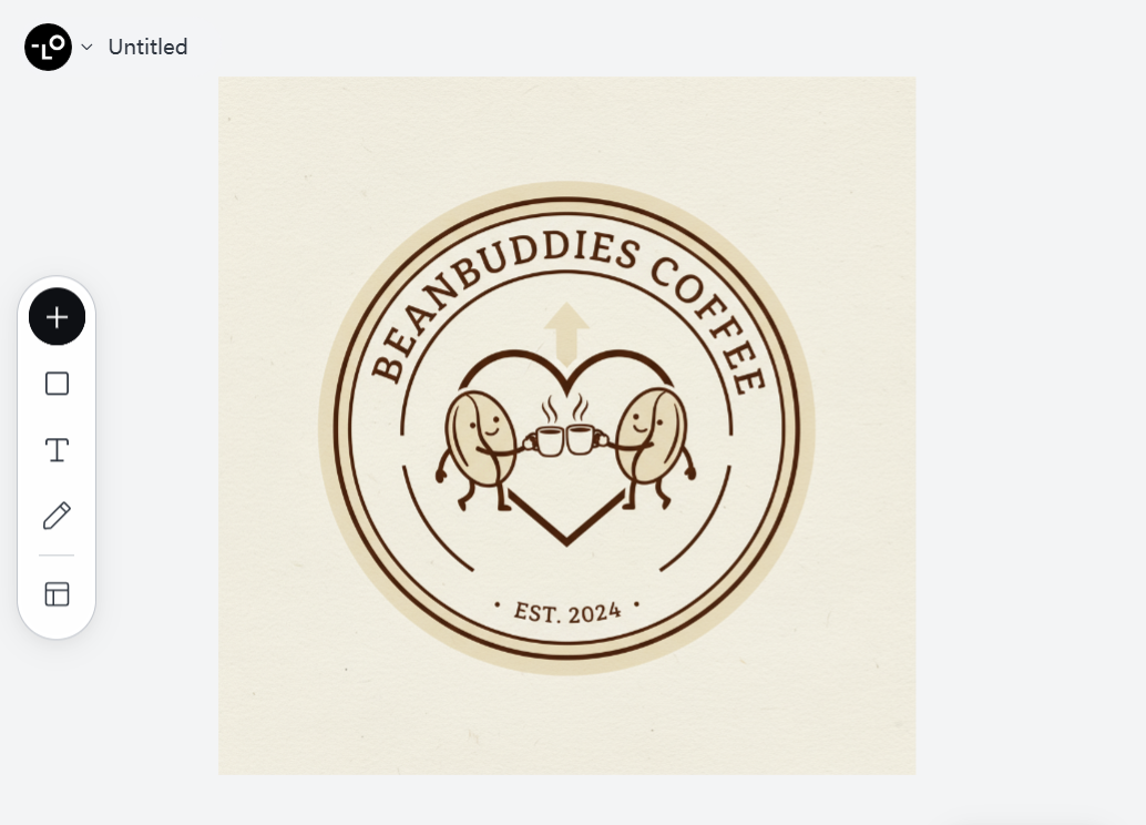
Solution: Focus on storytelling and brand values, not just trends. Test your logo in black and white first on Lovart to ensure it holds up without flashy effects.
The Tiny Screen Test—Scalability Matters
A gorgeous logo on your laptop might turn into a smudge on your phone. If your logo is unreadable at small sizes, that’s a logo design mistake to avoid in 2025.
- Bad Logo Design Example: An intricate mountain scene for “Summit Tech,” which looks great on a banner, but loses all detail as a favicon.
- Lovart Prompt Example: “Create a logo for ‘Summit Tech’ that is bold and recognizable even at 32x32 pixels.”
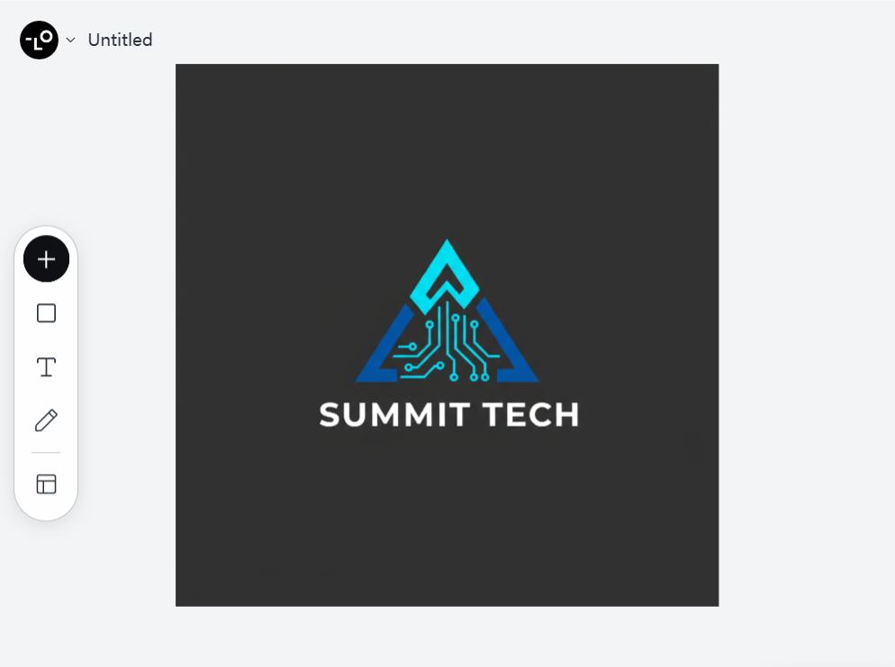
Solution: Always preview your logo at multiple sizes. Lovart’s canvas lets you mock up icons for web, mobile, and print in seconds—no more surprises.
Overcomplicating the Design—Simplicity Rules
More is not always better! Cluttered logos are hard to remember and reproduce. One of the logo design best practices is to aim for simplicity.
- Bad Logo Design Example: Using five fonts, four icons, and a rainbow color palette for “RainbowCycle Delivery.”
- Lovart Prompt Example: “Generate a simple, memorable logo for ‘RainbowCycle Delivery’ with one icon and a limited color scheme.”
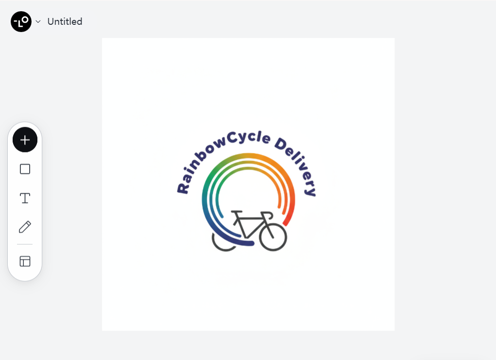
Solution: Start with basic shapes and one or two colors. Ask Lovart to simplify your draft by removing unnecessary elements.
Forgetting Color Psychology—Choose with Intention
Colors are not just pretty—they communicate emotion and meaning. Picking colors just because they “pop” is a recipe for bad logo design examples!
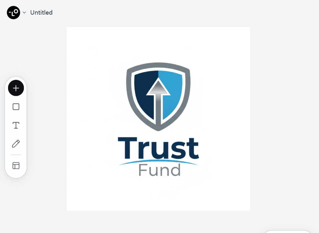
Bad Logo Design Example: A finance brand called “TrustFund” with hot pink and neon green.
Lovart Prompt Example: “Design a logo for ‘TrustFund’ using blue and grey to evoke trust and professionalism.”
- ColorEmotionBest ForBlueTrust, CalmFinance, TechRedEnergy, PassionFood, RetailGreenGrowth, HealthWellness, Eco-brandsOrangeCreativity, FunStartups, Kids
Solution: Research color psychology and try different palettes on Lovart to see what resonates with your brand story and target audience.
Ignoring Your Audience—Know Who You’re Designing For
A logo that looks cool to you might not connect with your customers. This is one of the most common logo errors—forgetting for whom you’re designing.
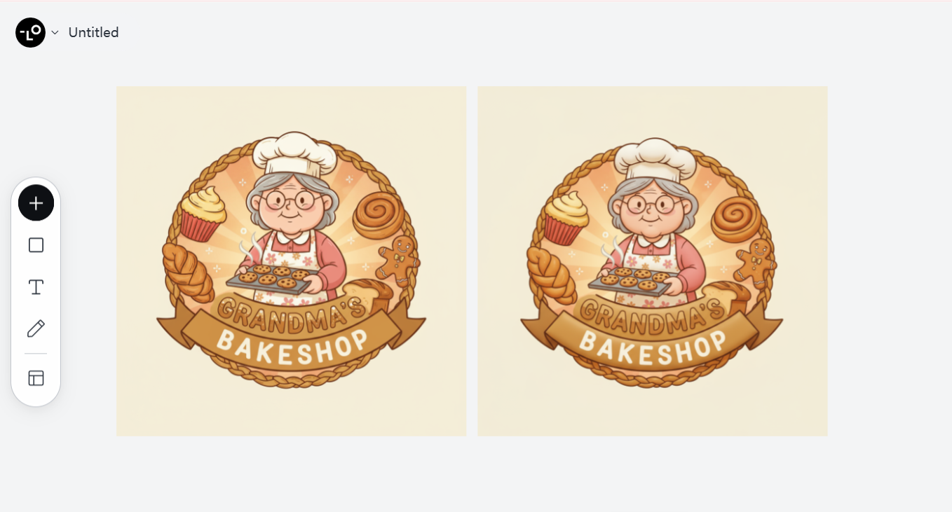
- Bad Logo Design Example: “Grandma’s Bakeshop” with a sharp, aggressive font and techy icon.
- Lovart Prompt Example: “Design a warm, inviting logo for ‘Grandma’s Bakeshop’ that appeals to families and kids.”
Solution: Build a quick buyer persona. Ask Lovart to generate three logo directions based on different target demographics and test with real users.
Bad Typography Choices—The Subtle Power of Fonts
Typography is the silent hero of logo design. The wrong font can make your logo look amateurish, while a great font elevates your whole brand.
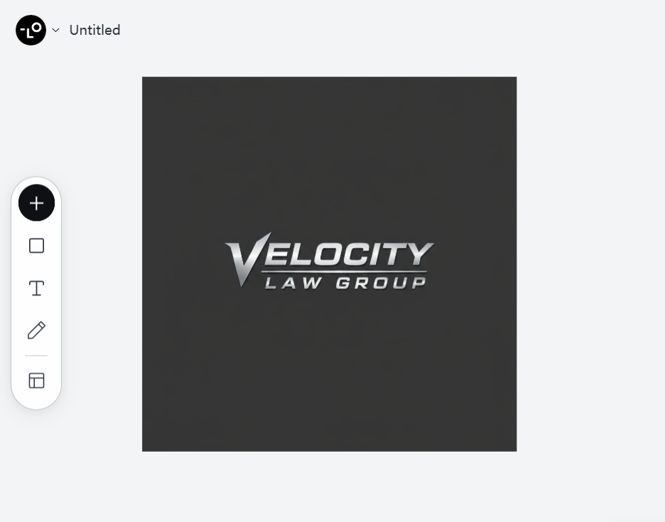
- Bad Logo Design Example: Using Comic Sans or a generic font for “Velocity Law Group.”
- Lovart Prompt Example: “Create a strong, modern wordmark for ‘Velocity Law Group’ using a custom, professional sans-serif font.”
Solution: Test several typefaces with your logo on Lovart. Explore customizations—rounded edges, letter spacing, or unique ligatures—to make your brand stand out.
Copy-Paste Syndrome—Originality Is Everything
With so many AI and template tools, it’s easy to end up with a logo that looks like everyone else’s. What makes a bad logo design? Lack of originality!
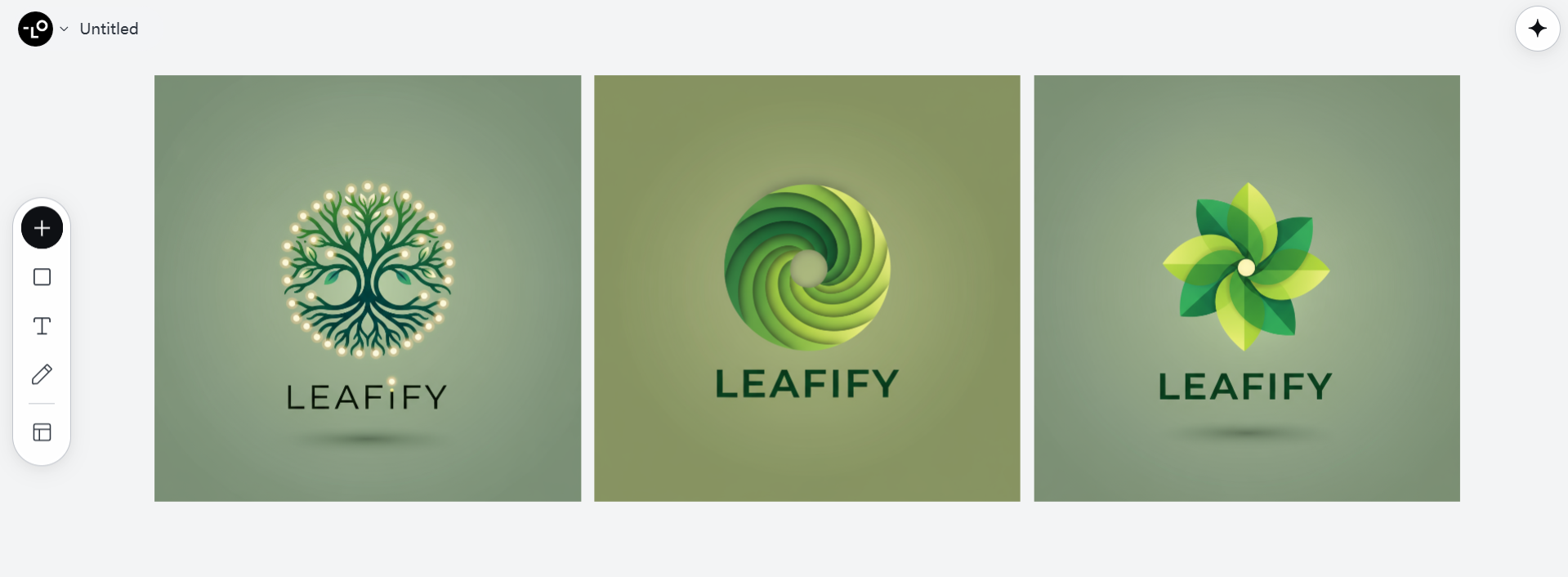
- Bad Logo Design Example: “Leafify” (an eco brand) using the same generic leaf icon as hundreds of competitors.
- Lovart Prompt Example: “Imagine an original symbol for ‘Leafify’—avoid standard leaf icons. Emphasize uniqueness and the brand’s mission.”
Solution: Use Lovart’s inspiration feature to explore unexpected directions and combine elements in new ways. Always check for logo uniqueness with a quick online search.
Summary Table: 7 Logo Design Mistakes & Solutions
| Mistake | Lovart Prompt | Solution |
|---|---|---|
| Trend-Chasing | “Classic, timeless logo for [Brand Name]” | Focus on core values, not trends |
| Not Scalable | “Design for [Brand]’s favicon & billboard” | Preview at all sizes |
| Too Complex | “Minimal, bold design for [Brand]” | Simplify, reduce elements |
| Poor Color Choices | “Color palette for [Brand] with [emotion]” | Research color psychology |
| Ignoring Audience | “Logo for [Brand], audience: [persona]” | Test with your market |
| Bad Typography | “Custom wordmark for [Brand]” | Refine font, letter spacing |
| Copy-Paste | “Unique icon for [Brand], avoid clichés” | Check originality |
From the Client Perspective — How to Communicate With Your Designer
Logo success isn’t just about design—it’s also about collaboration. Many logo projects go off track when clients and designers aren’t on the same page. Here are a few tips for clients working with designers (or using Lovart):
- Be Clear About Your Brand: The more you share about your values, audience, and vision, the better your designer (or AI) can deliver.
- Give Constructive Feedback: Be specific. Instead of “I don’t like it,” try “Can we try a softer color palette or a more playful font?”
- Trust the Process: Sometimes, the first draft isn’t perfect. Iterate, experiment, and stay open-minded!
Great communication leads to great logos—every time.
From the Marketer’s Perspective — How to Leverage Your New Logo
Your logo is just the beginning of your brand journey. Once you have a logo you love, use it strategically to boost brand recognition and loyalty:
- Consistency is Key: Use your logo in all marketing materials—website, social media, business cards, packaging, and ads.
- Tell Your Brand Story: Share the story behind your logo’s design in your marketing to connect emotionally with your audience.
- Monitor Performance: Track how your logo performs using analytics on social platforms—see which versions or placements get the most engagement.
A logo isn’t just a pretty symbol—it’s a powerful tool for marketing and storytelling.
From the User’s Perspective — What Makes a Logo Memorable?
Ultimately, your audience decides whether your logo is memorable or forgettable. Here’s what real users look for:
- Instant Recognition: The best logos are easy to identify, even at a glance or from a distance.
- Emotional Connection: Colors, shapes, and fonts should evoke the right feelings and values.
- Versatility: Memorable logos look great everywhere—from Instagram icons to billboard ads.
Before you finalize any logo, show it to real users and ask for their honest impressions. Their feedback is gold!
Logo Design Tips for 2025:
- Start every project with a clear creative brief—Lovart can help generate one!
- Test your logo in black & white before adding color.
- Preview your logo in real-world scenarios (social icons, print, signage) using Lovart’s mockup tools.
- Gather feedback from diverse users—share Lovart mockups with your team or community.
- Always save your vector files for perfect scalability.
Final Thoughts
Avoiding logo design mistakes isn’t just about following rules—it’s about understanding your brand, your audience, and the power of simplicity and originality. With tools like Lovart, you can explore, refine, and perfect your logo design in ways that were never possible before. So go forth, create boldly, and let your logo do the talking!
Happy designing—and may your logo never be mistaken for someone else’s!

分享文章