5 Common AI Illustration Mistakes and How to Fix Them in 2025

Hey there, creative souls! 👋
So you've discovered the magic of AI illustration tools and you're ready to create stunning visuals that'll make even seasoned designers do a double-take. But wait — why do your results look like they were created by an alien who's only heard about human art through radio signals?
Don't worry, you're not alone. As Lovart's popularity has exploded in 2025, I've seen countless users making the same AI illustration mistakes over and over again. The good news? These mistakes are totally fixable!
In this guide, we'll explore the 5 most common AI illustration mistakes that nearly everyone makes, plus the straightforward fixes that'll transform your AI artwork from "um, what is that?" to "wow, YOU made that?!"
Ready to level up your AI art game? Let's dive in!
Mistake 1: Vague Prompting - The AI Mind Reader Fallacy
Picture this: you have a gorgeous, detailed image in your head. You type "beautiful landscape" into Lovart and expect the AI to somehow extract that perfect vision from your brain. What you get instead is... well, technically a landscape, but nothing like what you imagined.
This is the number one AI illustration mistake I see people make: expecting AI to read your mind. Despite how advanced Lovart has become in 2025, it still can't peek inside your imagination (thankfully!).
Why This Happens:
- AI tools need specific guidance - they interpret based on patterns in their training data
- Vague prompts leave too much room for interpretation
- AI fills in gaps with its own "assumptions" from its training
The Fix: Be Specific and Structured
Think of prompting like directing a movie. The more details you provide, the closer the result will match your vision.
Here's a simple structure that works wonders:
| Prompt Element | Purpose | Example |
|---|---|---|
| Subject | What's the main focus? | A Norwegian forest cat |
| Environment | Where is the scene taking place? | sitting on a windowsill in a cozy cabin |
| Lighting | Sets mood and dimension | bathed in warm golden sunset light |
| Style/Aesthetic | The artistic approach | painted in a Studio Ghibli style |
| Technical details | Quality specifications | detailed fur texture, 8K resolution |
❌ Weak prompt: "Beautiful cat"
✅ Strong prompt: "A fluffy Norwegian forest cat sitting on a wooden windowsill in a cozy log cabin. The cat is bathed in warm golden sunset light streaming through the window, illuminating dust particles in the air. The scene is painted in a Studio Ghibli style with soft brush strokes. Ultra detailed fur texture, 8K resolution."
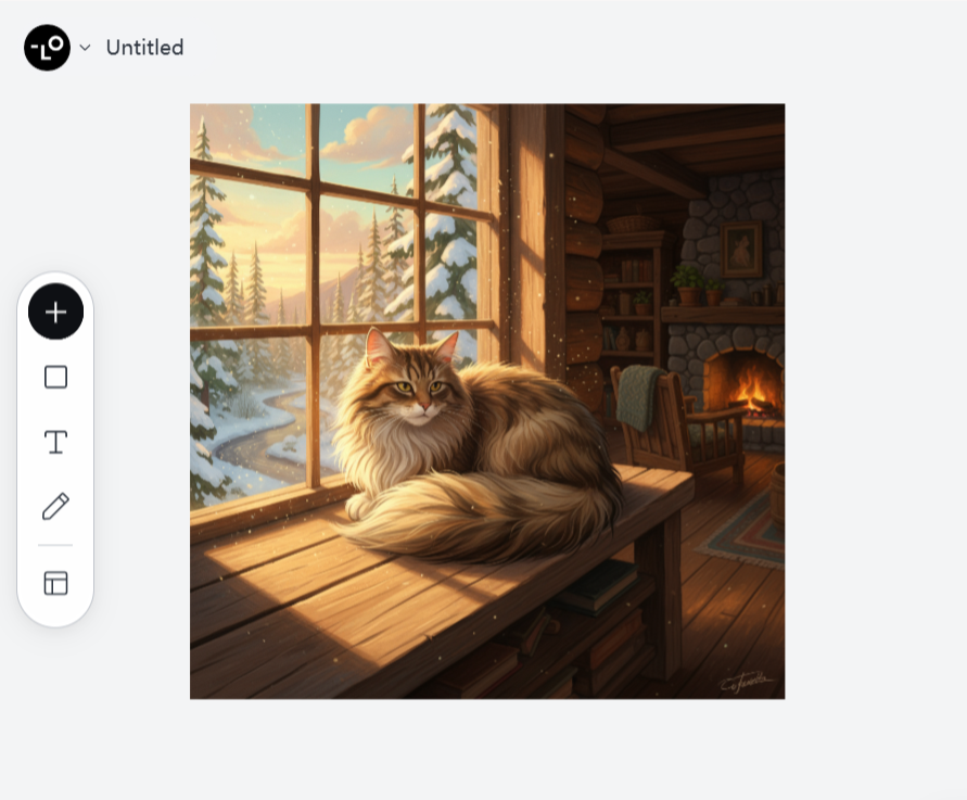
See the difference? The second prompt gives Lovart enough specific information to create something much closer to what you're envisioning. No mind-reading required!
Remember: AI illustration tools don't know what you want until you tell them. Be specific, be detailed, and watch your results improve dramatically.
Mistake 2: Ignoring Composition Fundamentals
Just because AI can generate an image in seconds doesn't mean we should throw basic art principles out the window. One of the most common AI illustration mistakes is failing to guide the AI on composition – how elements in your image are arranged.
Even in 2025, when Lovart has significantly improved its composition capabilities, it still benefits enormously from human guidance on this front.
Why This Happens:
- Users focus on subject matter but neglect how elements are arranged
- AI tools don't inherently understand visual weight and balance like humans do
- The AI might generate technically correct elements but place them awkwardly
The Fix: Direct the Composition
Include composition elements in your prompts to guide Lovart toward creating more visually appealing illustrations.
Key composition elements to specify:
- Framing (close-up, wide shot, bird's eye view)
- Rule of thirds (placing key elements at intersection points)
- Foreground, midground, background elements
- Leading lines that guide the viewer's eye
- Focal point location
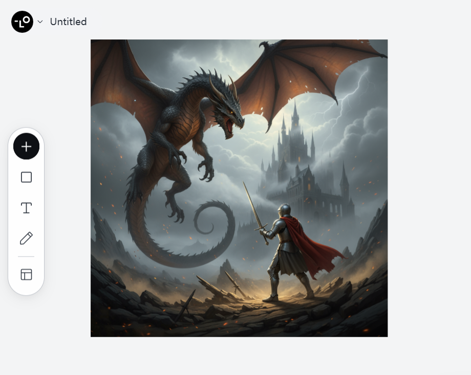
❌ Weak composition prompt: "A knight fighting a dragon"
✅ Strong composition prompt: "A knight fighting a dragon, with the knight positioned in the lower right third of the frame looking up at the dragon who dominates the upper left. The dragon's tail creates a diagonal leading line across the image. Dramatic lighting highlights the knight as the focal point, while a misty castle appears in the far background. Cinematic composition with depth of field."
Even better, use Lovart's ChatCanvas to sketch a rough layout of where you want elements positioned. The AI is remarkably good at following visual guidance combined with text instructions!
Pro tip: Study the composition of images you love and incorporate those elements into your prompts. This knowledge of composition fundamentals is what separates amateur AI art from professional-quality AI illustrations.
Mistake 3: Style Soup - The "Everything Bagel" Effect
Have you ever thrown a bunch of famous artists' names into your prompt, hoping for some magical hybrid masterpiece? "Create an illustration in the style of Salvador Dali meets Hayao Miyazaki with hints of Picasso and the color palette of Van Gogh."
Welcome to what I call "Style Soup" – one of the most persistent AI illustration mistakes even in 2025. It's like asking a chef to make a dish that's simultaneously Italian, Japanese, Mexican, and French. The result? A confusing mess that fails to capture the essence of any style.
Why This Happens:
- AI tries to honor all style references simultaneously
- Conflicting visual languages create inconsistent results
- The "more is better" fallacy leads to cluttered aesthetics
The Fix: Focused Style References
Instead of throwing every artist you admire into the mix, take a more focused approach:
Choose ONE primary style reference
Optionally add ONE secondary influence or modification
Be specific about which aspects of the style you want
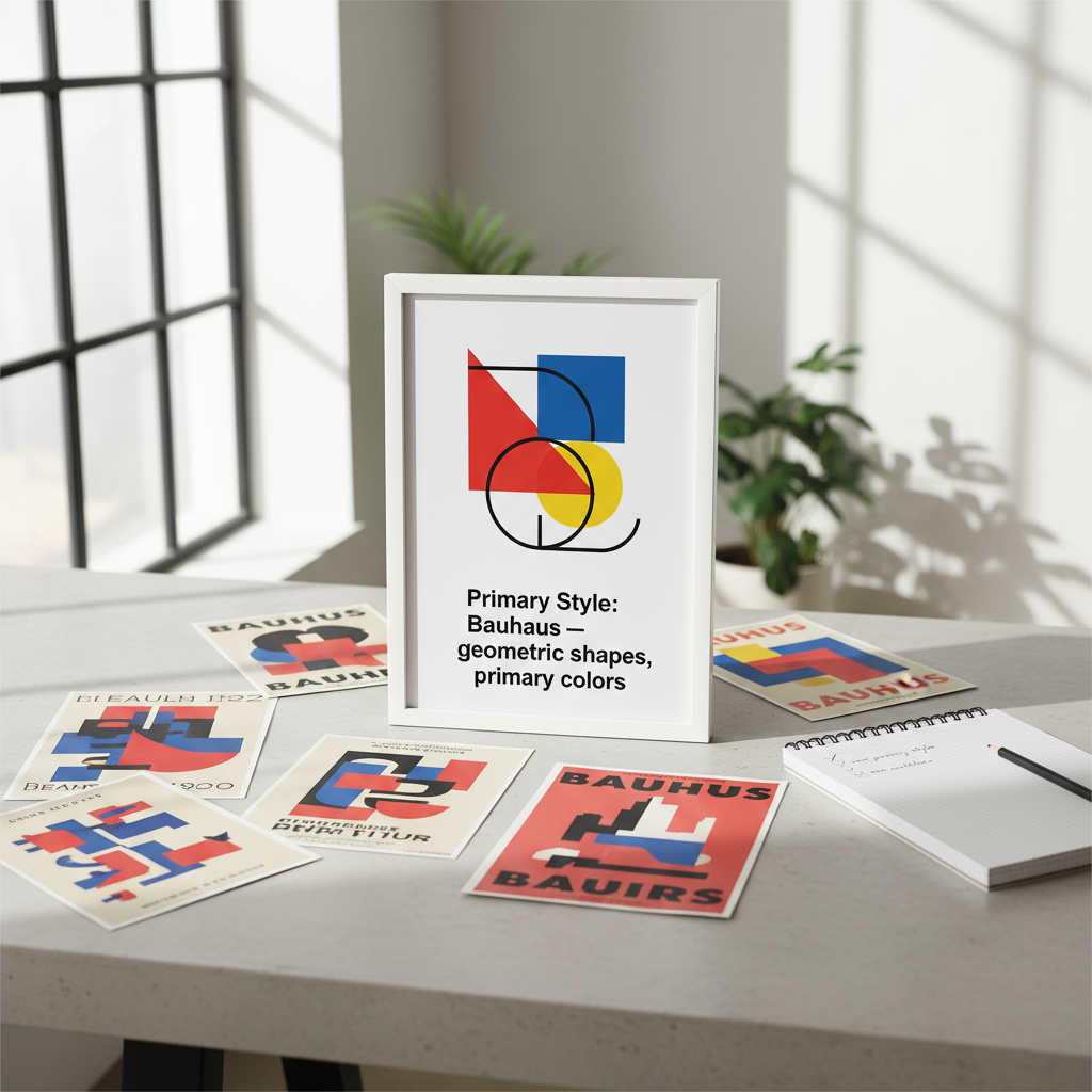
- ApproachExampleResultSingle Clear Style"Illustration of a forest witch in the distinctive style of Alphonse Mucha, with his characteristic Art Nouveau linework and decorative elements"Coherent style that captures Mucha's essenceStyle + Modification"Portrait in the style of Rembrandt's chiaroscuro lighting, but with a contemporary cyberpunk character"Clear primary style with thoughtful adaptationSpecific Style Elements"Landscape with Studio Ghibli's approach to cloud formations and natural lighting, emphasis on the whimsical treatment of wind movement"Focused application of specific stylistic elements
❌ Style soup prompt: "A landscape in the style of Monet meets cyberpunk with Bauhaus geometry and Japanese ukiyo-e textures, dramatic like Caravaggio"
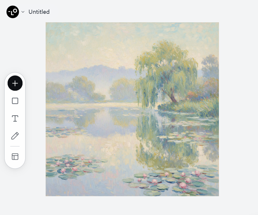
✅ Focused style prompt: "A landscape in Claude Monet's Impressionist style with his characteristic brush strokes and treatment of light. Focus on his approach to water reflections and atmospheric perspective using his typical pastel color palette."
Remember, you can always iterate! Start with a clear primary style, then make targeted adjustments in follow-up prompts. This approach yields much more coherent and appealing AI illustrations than throwing everything in at once.
Mistake 4: Neglecting Technical Specifications
Even as Lovart has evolved in 2025, one persistent AI illustration mistake remains: failing to specify technical aspects of the image you want to generate. This often results in illustrations that look good at first glance but fall apart when you need to use them for actual projects.
Think about it: would you hire a photographer without telling them what resolution you need, or whether the photo is for a billboard or a business card? The same principle applies to AI illustration.
Why This Happens:
- Users focus on creative elements but overlook technical requirements
- Default settings might not match your intended use case
- AI will make assumptions about technical aspects if not directed
The Fix: Include Technical Specifications
Always include relevant technical specifications in your prompts, especially for professional work:
| Technical Aspect | Why It Matters | Example Specification |
|---|---|---|
| Aspect Ratio | Ensures image fits intended placement | 16:9 landscape, 1:1 square, 9:16 portrait |
| Resolution | Determines image quality and usability | 8K, 4K, HD, detailed, high-resolution |
| Color Profile | Affects mood and use case | CMYK for print, vibrant RGB, monochromatic |
| Lighting Conditions | Sets atmosphere and dimension | Soft diffused light, harsh directional, golden hour |
| Depth of Field | Directs viewer attention | Shallow DoF with background blur, everything in focus |
Lovart now supports incredible technical precision when properly instructed. Use this to your advantage!
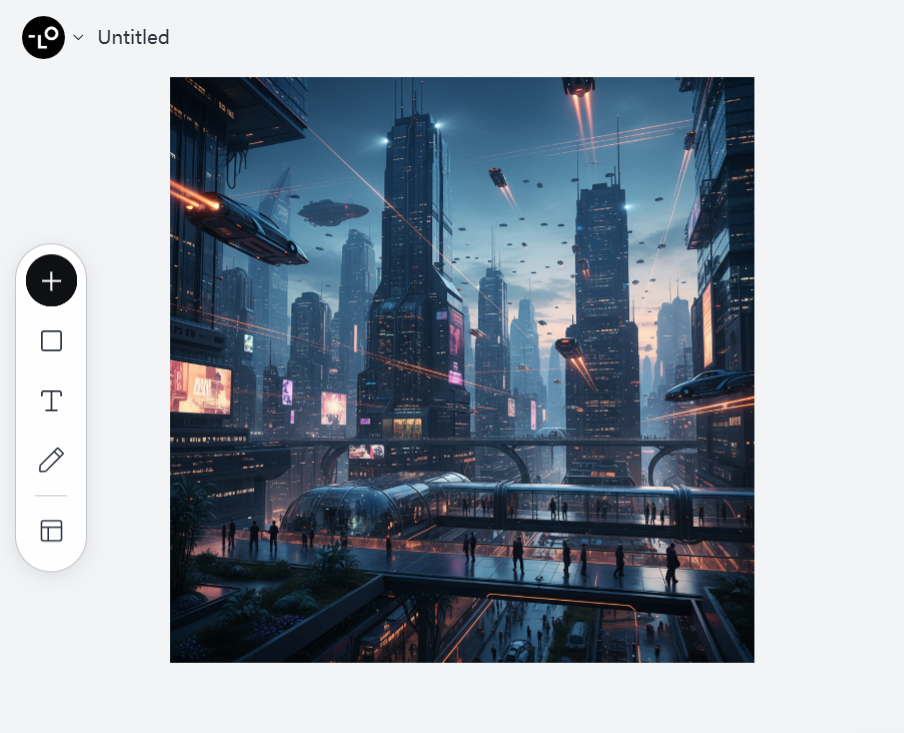
❌ Technically vague prompt: "A futuristic cityscape with flying cars"
✅ Technically specific prompt: "A futuristic cityscape with flying cars in 21:9 cinematic aspect ratio, 8K resolution. Use a complementary color scheme of deep blues and vibrant oranges. Apply atmospheric perspective with detailed foreground elements and progressively hazier distant structures. Implement volumetric lighting from multiple light sources with ray-traced reflections on glass and metal surfaces."
This approach not only creates better images but also saves you time by reducing the need for endless regenerations or post-processing.
Pro tip: For commercial projects, always specify technical requirements upfront. For instance, if you need negative space for text overlay, mention "composition with empty space in the upper third for text placement" in your prompt.
Mistake 5: Failing to Iterate and Refine
The final and perhaps most costly AI illustration mistake is treating AI art generation as a one-and-done process. Even in 2025, with Lovart's amazing capabilities, the first result is rarely the best possible outcome.
Too many users give up after one or two attempts, missing out on the truly exceptional results that come from thoughtful iteration.
Why This Happens:
- Unrealistic expectations that perfect results should come immediately
- Not understanding that AI art generation is a conversation, not a vending machine
- Lack of systematic approach to refinement
The Fix: Embrace Iterative Prompting
Think of working with Lovart as a collaborative process. Great AI illustrations emerge through thoughtful iteration and refinement.
Here's a proven iteration workflow that yields professional results:
- Step 1: Start with a foundational prompt
Begin with a clear but not overly complex prompt that establishes the basic concept.
Example: "A fox spirit guardian in a magical forest clearing, digital illustration style"
- Step 2: Analyze the result and identify specific improvements
Don't just think "I don't like it" - articulate exactly what aspects need changing.
Example observations: "The fox's proportions look off," "The lighting is too flat," "The forest lacks depth"
- Step 3: Make targeted adjustments one at a time
Focus on addressing one major aspect per iteration rather than changing everything at once.
Example refinement: "Keep the same concept but make the fox's proportions more anatomically correct while maintaining the mystical quality. Add more definition to the facial features."
- Step 4: Use Lovart's feedback tools
Utilize the platform's ability to accept visual feedback through ChatCanvas - circle elements you want to keep or change.
Example: Circle the fox and type "I like this pose but please refine the anatomical proportions while keeping the magical quality"
- Step 5: Document your successful prompts
Keep track of what works for future reference and further refinement.
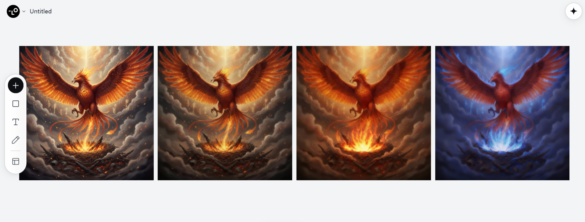
❌ One-shot approach: Generate once, get frustrated, give up
✅ Iteration approach: "Let's create a mythical phoenix rising from ashes. [Initial result] Now adjust the composition to place the phoenix in the center with wings fully extended. [Next result] Great! Let's enhance the flames with more vibrant oranges and reds. [Final result] Perfect! Can we try one variation with cooler blue and purple flames for contrast?"
Bonus Tips for Lovart in 2025
Now that we've covered the major AI illustration mistakes, here are some Lovart.ai-specific tips that will give you an extra edge:
Leverage Lovart's Multimodal Features
In 2025, Lovart's ability to understand multiple input types is revolutionary. Don't just stick to text prompts!
- Use the sketch feature to quickly outline compositions
- Upload reference images to guide style and content
- Record voice notes to explain complex concepts
- Combine all three for best results
Explore Lovart's Style Libraries
The platform now offers curated style libraries that are far more nuanced than simple artist references:
- Browse the "Trending in 2025" collection for contemporary styles
- Experiment with the "Era Fusion" collection that blends historical art movements
- Try the "Cross-Cultural" collection for global artistic perspectives
Master the Art of Negative Prompting
Lovart has refined the ability to understand what you don't want:
"Create a serene landscape, avoiding oversaturated colors, no people or buildings, without typical sunset clichés"

Putting It All Together: A Complete Prompt Framework
Let's combine everything we've learned to create a comprehensive prompt framework that avoids all five common AI illustration mistakes:
| Component | Purpose |
|---|---|
| SUBJECT | Detailed description of main subject |
| ENVIRONMENT | Where the scene takes place |
| COMPOSITION | How elements are arranged, perspective, framing |
| STYLE | Primary artistic style with specific elements |
| MOOD/LIGHTING | Emotional tone and lighting conditions |
| TECHNICAL SPECS | Resolution, aspect ratio, color profile |
| AVOID | Elements to exclude or problems to prevent |
Example of this framework in action:
| Component | Description |
|---|---|
| SUBJECT | A wise old sea turtle with intricate patterns on its shell that subtly form a map of ancient constellations. The turtle has gentle, knowing eyes with small glowing specks that mirror stars. |
| ENVIRONMENT | Deep underwater scene with a coral reef in the middle distance. Ancient ruins partially covered by coral and seaweed visible in the background. |
| COMPOSITION | Looking slightly up at the turtle as it swims from lower left toward upper right. Rule of thirds composition with the turtle's eye at an intersection point. Foreground shows detailed small fish and plant life, creating depth. |
| STYLE | Digital painting similar to Tomás Sánchez's meticulous detail work, with careful attention to light behavior underwater. Not photorealistic but highly detailed with visible brushwork in less focal areas. |
| MOOD/LIGHTING | Mysterious but peaceful atmosphere. Primary light source is dappled blue sunlight filtering through water from above, with secondary subtle bioluminescent elements from certain coral formations. |
| TECHNICAL SPECS | 16:9 aspect ratio, 8K resolution, rich blue-green color palette with occasional complementary orange accents from specific coral elements. |
| AVOID | No human elements, no cartoonish features on the turtle, avoid oversaturated colors, and prevent unrealistic underwater physics like clearly defined light rays that wouldn't occur at this depth. |
Conclusion: Beyond the Mistakes
As we navigate the exciting world of AI illustration in 2025, avoiding these common mistakes will dramatically improve your results with Lovart and similar tools. But remember, the goal isn't perfection on the first try - it's developing a collaborative relationship with the AI that leverages both its computational power and your creative vision.
The most successful AI artists aren't those with the most technical knowledge of prompting - they're the ones who approach the process with curiosity, patience, and a willingness to guide the AI through thoughtful iteration.
So next time you're facing AI illustration problems or encountering AI artwork troubleshooting challenges, revisit these fixes:
- Be specific and structured in your prompts
- Guide composition deliberately
- Focus on coherent styles instead of "style soup"
- Include technical specifications
- Embrace iteration and refinement
The future of AI illustration isn't about replacing human creativity - it's about extending it. By avoiding these common AI illustration mistakes, you're not just creating better images; you're developing a new kind of creative partnership that will define visual creation for years to come.
What AI illustration mistakes have you encountered? Share your experiences and fixes in the comments below - let's learn together!
Try creating your next masterpiece in Lovart using the frameworks from this article. I'd love to see what you create!

Partager l'Article