AI Brand Design Mistakes to Avoid: Pro Tips for Better Results

Hey there, creative minds! 👋 So you've discovered the magic of AI design tools like Lovart and you're ready to revolutionize your brand's visual identity. That's awesome! But before you dive headfirst into the AI design ocean, let's have a chat about some common pitfalls that might leave your brand looking more "meh" than "wow."
In this guide, we'll explore the most common AI design mistakes that brands make and share practical tips to help you harness the full potential of Lovart. Whether you're a seasoned designer looking to supercharge your workflow or a marketing pro trying to create stunning visuals without a design degree, this article is your roadmap to AI design success.
Let's turn those potential AI design mistakes into opportunities for creating jaw-dropping brand assets that truly stand out! 🚀
Common AI Brand Design Mistakes to Avoid
Generic Prompting: The Creativity Killer
One of the biggest AI design mistakes beginners make is using vague, uninspired prompts. If you ask for "a modern logo," you'll get something... well, generically modern. Your brand deserves better than that!
The Problem: Generic prompts lead to generic results, leaving your brand looking like everyone else's.
When working with Lovart, think of your prompts as detailed creative briefs. The more specific you are, the better the AI can understand your vision and create something truly tailored to your brand.
Pro Tip: Use descriptive language, reference specific styles, and include your brand values in your prompts.
- Example Prompt: Bad vs. Good
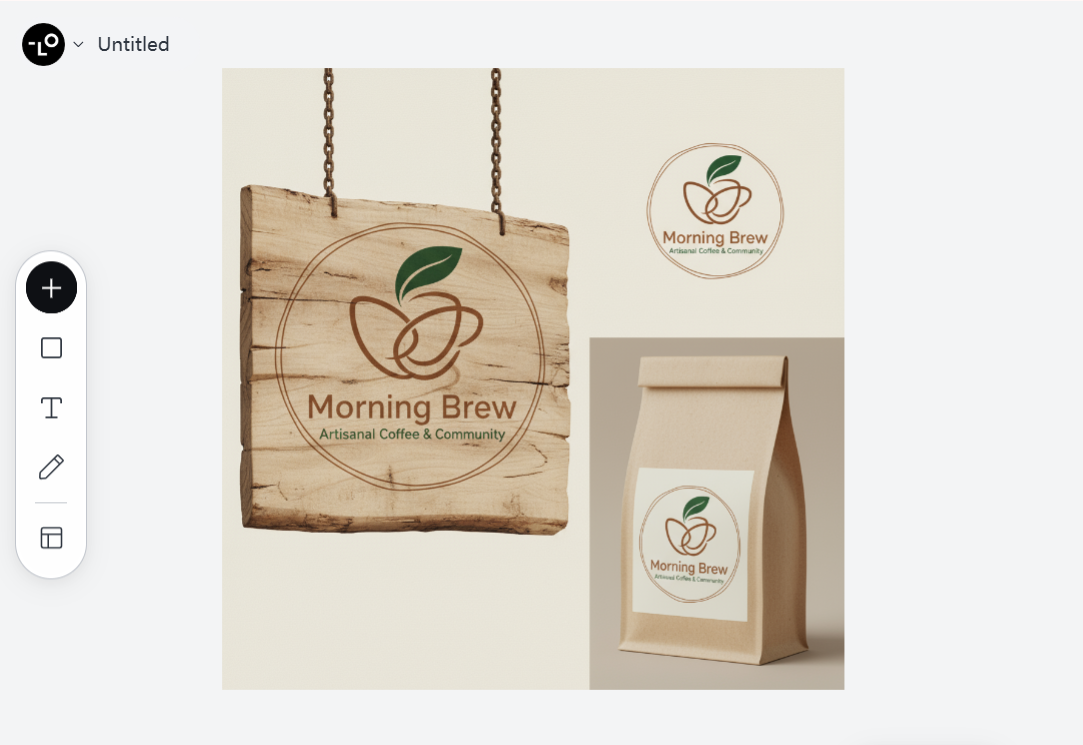
- Bad prompt: "Create a logo for a coffee shop."
- Good prompt: "Design a minimalist logo for 'Morning Brew', an artisanal coffee shop with a warm, inviting atmosphere. The brand values craftsmanship and community. Use earthy tones like warm browns and forest greens. The logo should work well on packaging and signage."
Neglecting Brand Consistency Across Designs
Another common AI design mistake is creating visuals in isolation without considering your overall brand identity. Consistency is key in branding, and AI tools need guidance to maintain it.
The Problem: Inconsistent visuals across different touchpoints confuse your audience and dilute your brand identity.
Lovart excels at maintaining consistency when properly instructed. Its ability to remember your brand elements across different design projects makes it a powerful ally for cohesive branding.
Pro Tip: Create a brand style guide within Lovart by describing your brand's color palette, typography, and visual style in detail. Reference this in future prompts.
- Example Prompt: Creating Brand Consistency
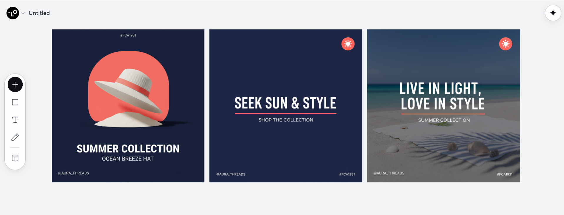
- "Using our established brand colors (midnight blue #0A1931, coral #FC5185, and white #F0F0F0) and our sans-serif primary font, design a series of social media templates for our 'Summer Collection' that maintain our minimalist, clean aesthetic while incorporating seasonal elements."
Overreliance on AI Without Human Refinement
A dangerous AI design mistake is treating AI-generated designs as finished products rather than starting points. Even with advanced tools like Lovart, human judgment remains essential.
The Problem: Skipping the human refinement process can result in designs that miss the mark on emotional resonance or contain subtle issues only human eyes would catch.
Remember that AI design tools are collaborators, not replacements. Lovart works best when you engage with it in an iterative process, providing feedback and making adjustments.
Pro Tip: Use Lovart to generate multiple options, then apply your human expertise to select, refine, and finalize the best designs.
- Example Prompt: Iterative Design Process
- "I like the social media template you created, but I'd like to see three variations with slightly different layouts. Keep the same color scheme but experiment with different placements for the text and product images. I want to compare options before finalizing."
Ignoring Design Fundamentals
Many users make the AI design mistake of forgetting that good design principles still matter, regardless of who (or what) creates the design.
The Problem: Neglecting design fundamentals like balance, contrast, hierarchy, and whitespace results in visually confusing or unprofessional designs.
Lovart has design principles built into its algorithms, but you should still guide it with your knowledge of what makes good design.
Pro Tip: Incorporate specific design principles in your prompts to ensure visually appealing results.
- Example Prompt: Incorporating Design Principles
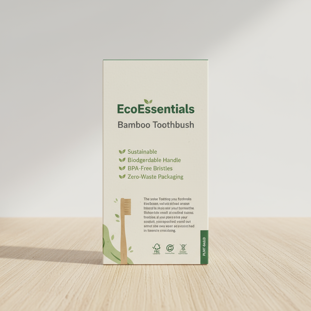
- "Design a product packaging that utilizes the principle of visual hierarchy to emphasize our brand name 'EcoEssentials' first, followed by the product type 'Bamboo Toothbrush', and then the eco-friendly features. Use plenty of white space and ensure there's strong contrast between text and background for readability."
Forgetting the Target Audience
A critical AI design mistake is creating designs that look good but don't resonate with your specific audience.
The Problem: Designs that don't consider audience preferences, demographics, and behaviors fail to connect, regardless of their aesthetic quality.
Lovart can tailor designs to specific audiences when given the right context about who you're trying to reach.
Pro Tip: Include audience information in your prompts to create designs that truly speak to your target market.
- Example Prompt: Audience-Centered Design
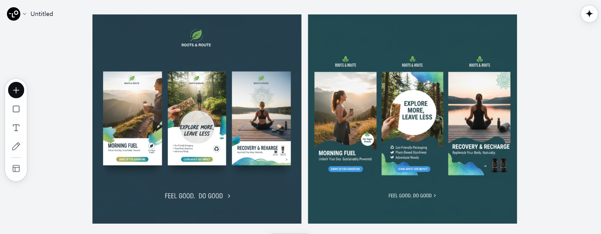
- "Create Instagram story templates for our fitness supplement brand targeting health-conscious millennials (25-35) who are interested in outdoor activities and sustainable products. The designs should feel energetic yet mindful, incorporating natural elements with vibrant accents."
AI Design Tips for Better Results in Lovart
Now that we've covered the major pitfalls, let's explore some proactive strategies to maximize your results with Lovart!
Master the Art of Detailed Prompting
The quality of your AI-generated designs directly correlates with the quality of your prompts. Learning to craft detailed, specific prompts is perhaps the most valuable AI design tip.
| Prompt Element | Why It Matters | Example |
|---|---|---|
| Design Type | Sets clear expectations | Logo, social media post, packaging, etc. |
| Brand Name | Personalizes the design | "For our brand 'Zenith Wellness'" |
| Color Preferences | Ensures brand consistency | "Using our brand colors: teal, white, and gold" |
| Style Description | Guides aesthetic direction | "Minimalist with organic shapes" |
| Target Audience | Focuses design appeal | "For professional women ages 30-45" |
| Usage Context | Informs practical design choices | "Will be primarily viewed on mobile devices" |
| Brand Values | Infuses meaning | "Emphasizing sustainability and luxury" |
Pro Tip: Start collecting a library of your most successful prompts for reuse and refinement over time.
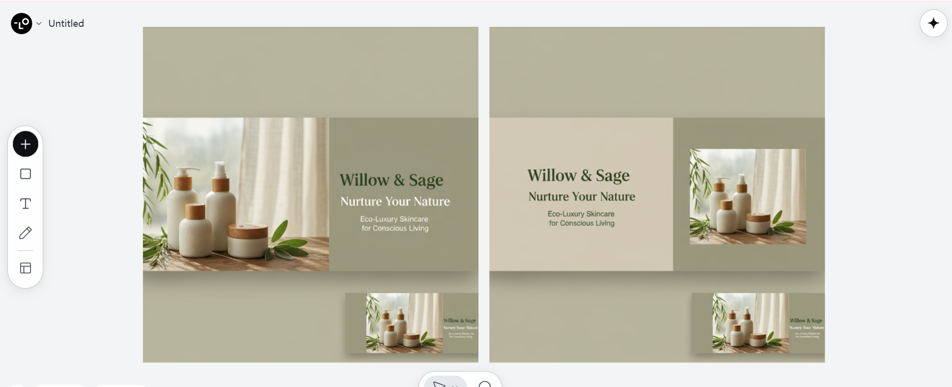
Example Prompt: Comprehensive Design Brief
"Create a website hero banner for 'Willow & Sage', an eco-luxury skincare brand targeting conscious consumers (primarily women 30-55 with disposable income). The design should balance minimalism with natural elegance, featuring soft, muted greens and warm beiges. Include space for the tagline 'Nurture Your Nature' and focus on evoking a sense of calm and self-care. The banner will be displayed on desktop and mobile, so ensure text remains legible when scaled down."
Leverage Reference Images
Sometimes words alone can't fully capture the visual style you're seeking. One of the most powerful AI design tips is to use reference images alongside your text prompts.
Lovart's ability to understand and adapt from visual references is remarkable. By providing examples of styles, layouts, or specific elements you like, you give the AI a much clearer target to aim for.
Pro Tip: Create mood boards of designs you admire and reference them when working with Lovart.
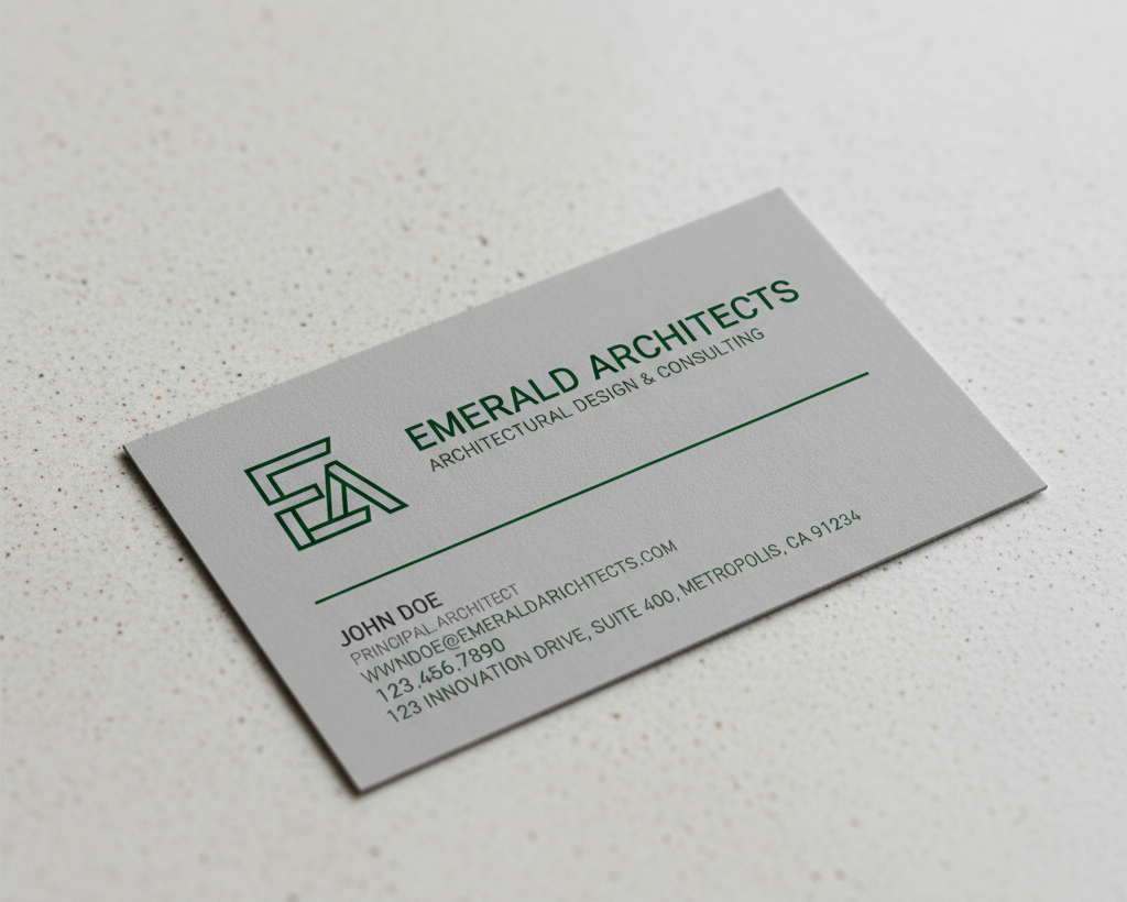
Example Prompt: Using References
"Design a business card for 'Emerald Architects' in a style similar to the minimalist architectural firms in these reference images. Incorporate our logo and use a similar layout to the third reference, but with our brand colors (emerald green #046307 and cool gray #BCBCBC)."
Embrace Iterative Design
Great design rarely happens in a single attempt. One of the most valuable AI design best practices is treating the process as a conversation rather than a one-and-done request.
Lovart excels when you provide feedback on initial designs and guide it through revisions. This iterative approach often leads to much stronger final results.
- Start with a broader concept
- Review what works and what doesn't
- Request specific changes
- Refine the design through multiple iterations
- Finalize once you're satisfied
Pro Tip: Don't be afraid to mix and match elements from different generations to create your perfect design.
Example Prompt: Iterative Process
Initial: "Design a modern podcast cover for 'Future Finance' that conveys fintech and innovation"
Iteration 1: "I like the color gradient in version 2, but can we try a simpler icon similar to version 3? Also, make the text more prominent and try a more futuristic font."
Iteration 2: "The new font works well. Now let's adjust the icon to be about 20% smaller and move it to the right side to create better balance. Can we also slightly lighten the background gradient to improve text contrast?"
Create Comprehensive Brand Packages
Instead of designing individual elements in isolation, use Lovart to create complete brand packages for cohesive results.
This approach ensures consistency across all your brand touchpoints and can save significant time compared to piecemeal creation.
Pro Tip: Start with core brand elements (logo, colors, typography) and then expand to applications like social media templates, business cards, and marketing materials.
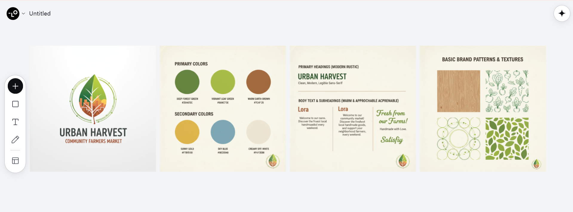
Example Prompt: Brand Package Request
"Create a complete brand starter package for 'Urban Harvest', a community-based farmer's market. Include: 1) A primary logo with variations (full color, one-color, and icon only), 2) Color palette with primary and secondary colors, 3) Typography recommendations, 4) Basic brand patterns or textures, 5) Social media profile images, and 6) Business card design. The brand should feel fresh, vibrant, and community-oriented with a modern rustic aesthetic."
Consider Technical Requirements
A commonly overlooked AI design tip involves specifying technical requirements in your prompts. This ensures the designs you receive are not just beautiful but practical for their intended use.
Consider elements like:
- Required dimensions and aspect ratios
- File formats needed
- Color spaces (RGB for digital, CMYK for print)
- Resolution requirements
- Space needed for text or other elements
Pro Tip: Always specify dimensions and usage context to avoid redesigns later.
Example Prompt: Including Technical Specs
"Design an Instagram carousel post set (1080x1080px, RGB) for our skincare product launch. Create 5 slides with the first being a cover slide, followed by key benefits, ingredients, price point, and call to action. Leave adequate space at the bottom of each slide for caption visibility, and ensure text is legible on mobile devices."
Comparing Common AI Branding Pitfalls and Solutions
| AI Brand Design Mistake | Impact on Brand | Solution with Lovart |
|---|---|---|
| Generic, template-like designs | Brand appears unoriginal and forgettable | Use specific, detailed prompts that incorporate unique brand attributes and values |
| Inconsistent visual identity | Confuses customers and weakens brand recognition | Create and reference a brand style guide in all prompts |
| Trendy but impractical designs | Short-lived appeal that requires frequent redesigns | Balance trend-awareness with timeless design principles |
| Disconnected from target audience | Fails to resonate with intended customers | Include detailed audience personas in your design briefs |
| Technically flawed for actual use | Designs that look good but don't perform in real-world applications | Specify technical requirements and usage contexts |
| Overcomplicated visuals | Message gets lost in visual noise | Request designs that prioritize clarity and purpose |
| Lacks emotional connection | Brand feels soulless or corporate | Incorporate story elements and emotional cues in prompts |
Advanced AI Design Tips for Brand Differentiation
Ready to take your AI-generated designs from good to unforgettable? Let's explore some advanced strategies for creating truly distinctive brand assets with Lovart.
Develop a Unique Visual Language
Rather than designing isolated pieces, work with Lovart to develop a cohesive visual language that becomes instantly recognizable as your brand.
This might include:
- Custom illustration styles
- Signature photo treatments
- Distinctive compositional approaches
- Recurring motifs or symbols
Pro Tip: Once you've established elements of your visual language, explicitly reference them in future prompts for consistency.
Example Prompt: Creating Visual Language
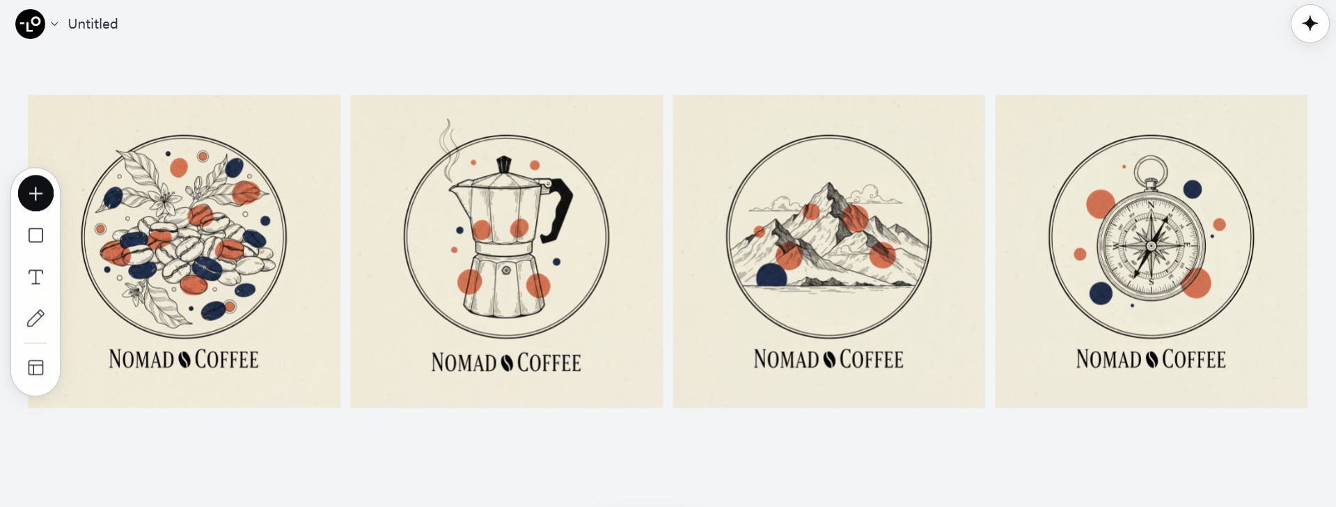
"Design a set of custom illustrations for our brand 'Nomad Coffee' that we can use across all marketing materials. The illustration style should feature hand-drawn line art with selective color highlights in our brand colors (terracotta and navy). Include illustrations of: coffee beans, a moka pot, mountains, and a compass. These will become recurring motifs in our brand's visual language."
Incorporate Brand Storytelling
Elevate your designs from merely aesthetic to meaningful by incorporating elements of your brand's story and values.
Lovart can integrate narrative elements that reinforce your brand's purpose and heritage when properly prompted.
Pro Tip: Share your brand's origin story, mission, and key values with Lovart when creating cornerstone brand assets.
Example Prompt: Story-Driven Design
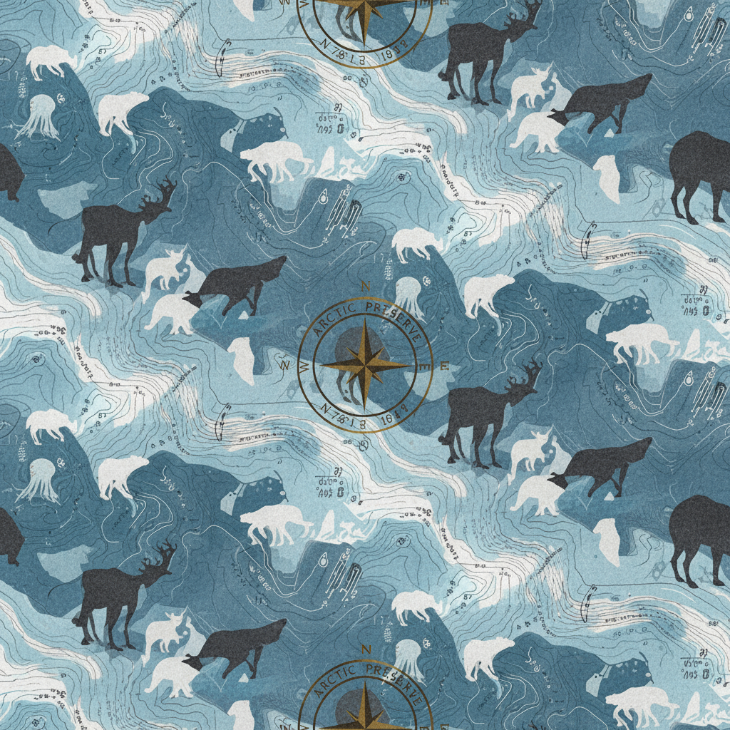
"Create a brand pattern for 'Arctic Preserve', a conservation-focused outdoor apparel company founded by polar explorers. The pattern should subtly incorporate elements from our story: compass readings from our founders' first expedition, arctic wildlife silhouettes, and topographic lines representing the changing ice caps we're working to protect. The pattern will be used on product linings and packaging, conveying our heritage and mission."
Design for Emotional Response
The most effective brand designs don't just look good—they make people feel something. Guide Lovart to create designs with specific emotional targets in mind.
Pro Tip: Explicitly state the emotional response you want to evoke in your audience.
Example Prompt: Emotion-Targeted Design
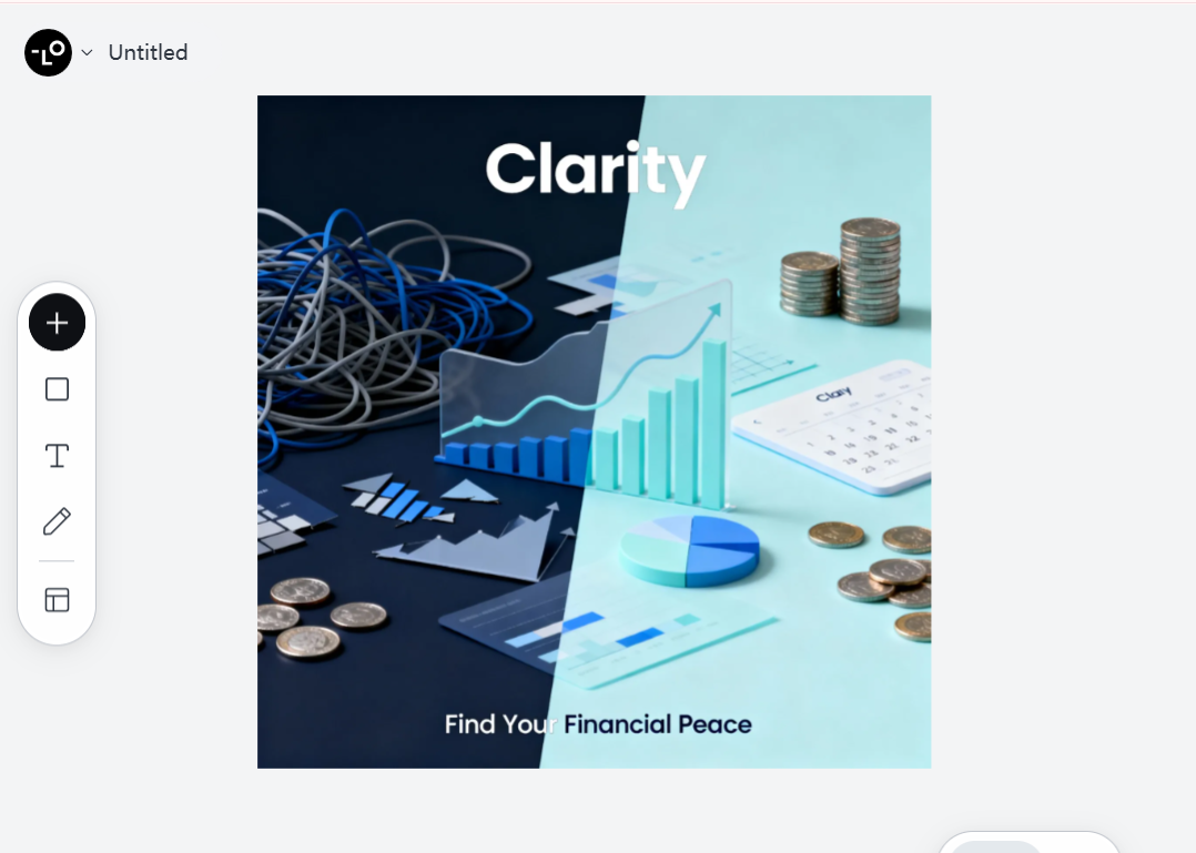
"Design a homepage hero image for our financial wellness app 'Clarity' that evokes a feeling of relief and confidence. The design should visually represent the transition from financial anxiety (perhaps shown through darker, chaotic elements on one side) to financial peace (shown through lighter, organized elements). The goal is for our target audience of young professionals to feel an immediate sense of 'this is the solution to my money stress' when they see this image."
Common AI Design Mistakes: Before and After Examples
Let's look at some concrete examples of how adjusting your approach with Lovart can dramatically improve results:
Before & After: Logo Design
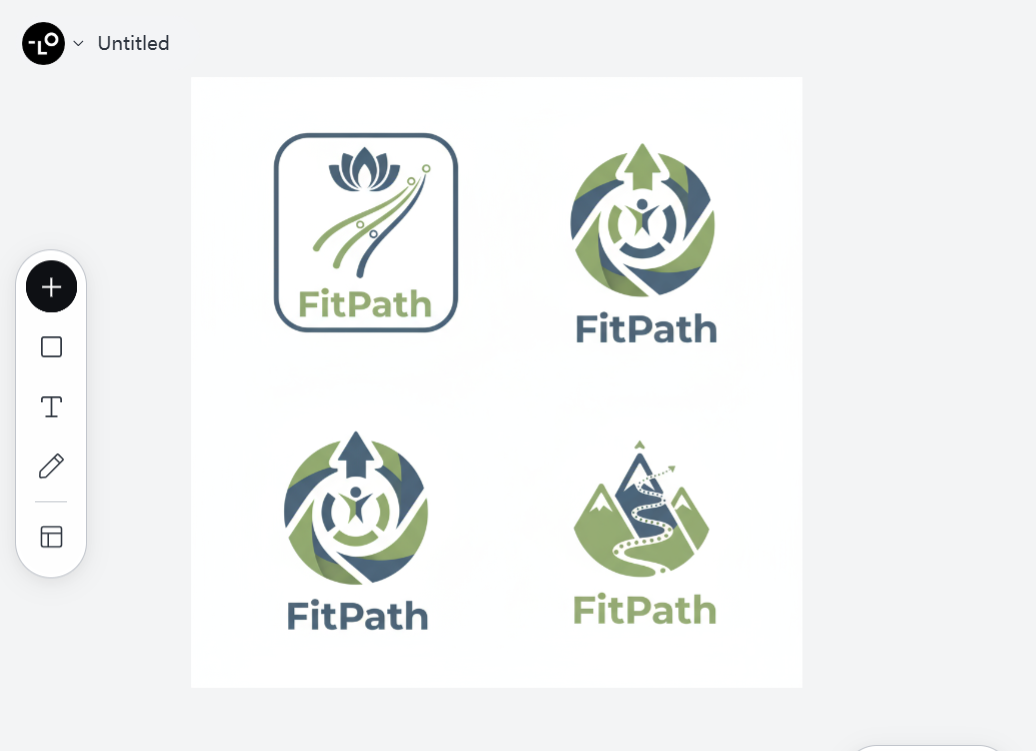
BEFORE - Generic Prompt: "Create a logo for a fitness app called FitPath."Result: A predictable dumbbell icon with generic typography that looks like dozens of other fitness logos.
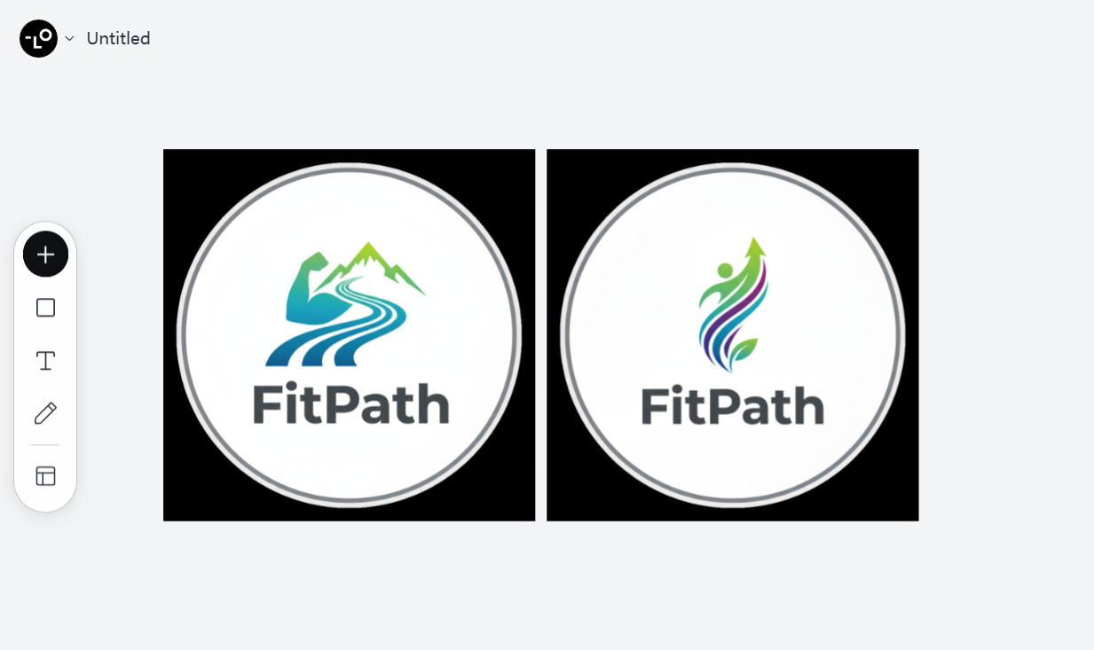
AFTER - Specific Prompt: "Design a distinctive logo for 'FitPath', a holistic fitness app that focuses on journey-based progress rather than quick results. Our audience is 30-45 year old professionals who value balance in their lives. The logo should avoid gym clichés (no dumbbells or muscular figures) and instead use a path/journey visual metaphor. Our brand colors are sage green (#8A9A5B) and slate blue (#708090), and we prefer geometric sans-serif typography with moderate weight. The logo should work well at small sizes on app icons and in monochrome versions."Result: A unique, meaningful logo with a clever path motif that stands out from competitors and properly represents the brand's approach to fitness.
Before & After: Social Media Design
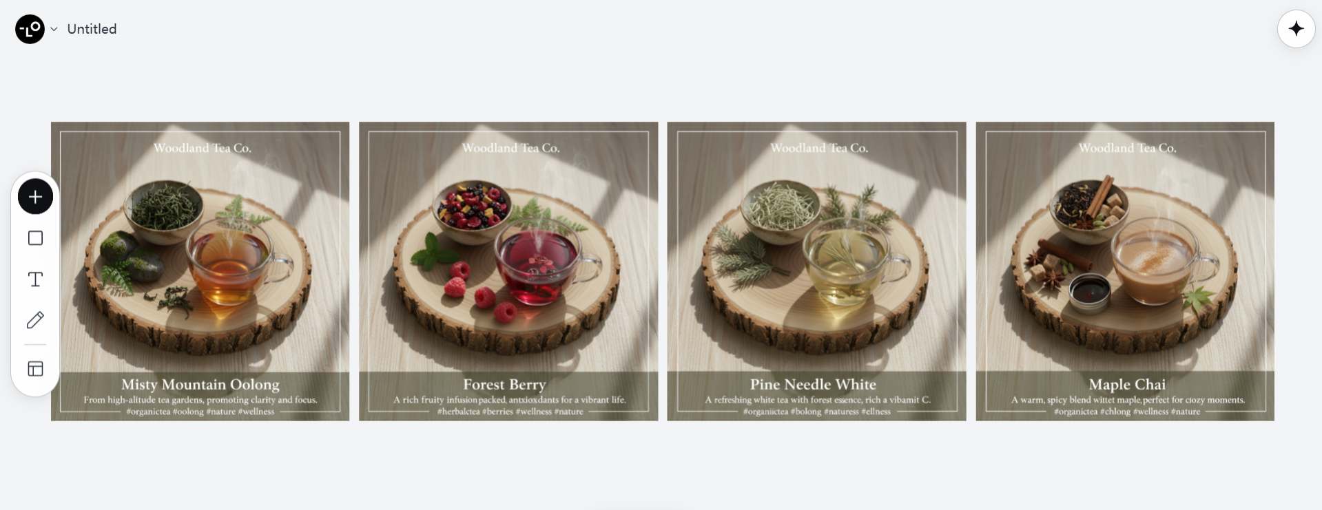
BEFORE - Vague Prompt: "Create Instagram posts for our organic tea brand."Result: Generic tea imagery that could belong to any brand, with no distinctive style or strategic content hierarchy.
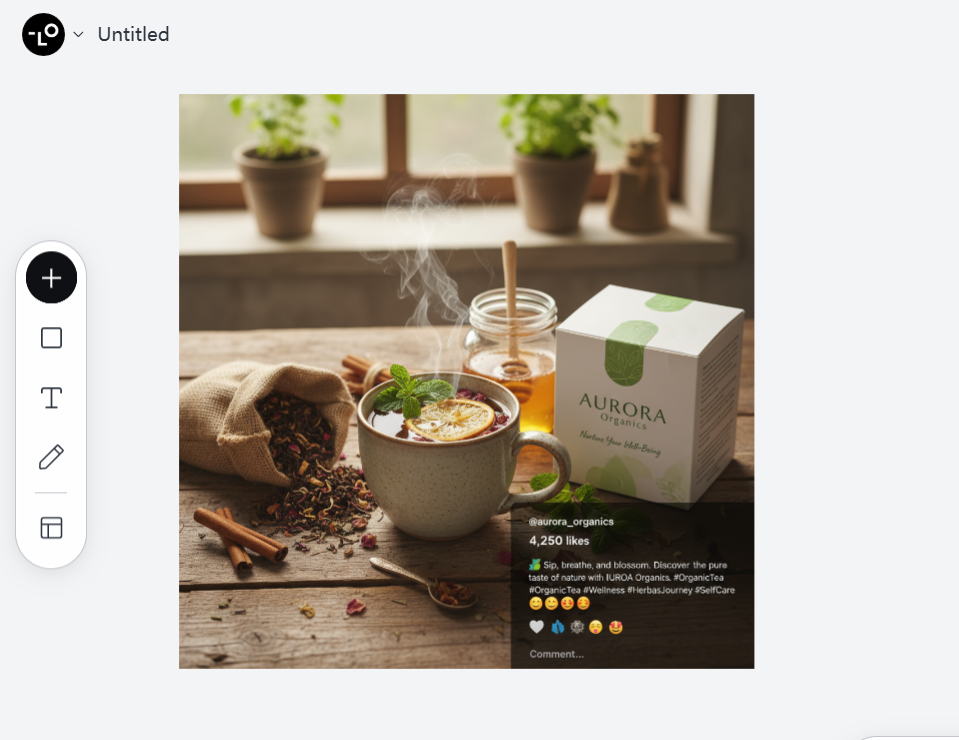
AFTER - Strategic Prompt: "Design a set of 4 Instagram posts (1080x1080px) for 'Woodland Tea Co.', our organic tea brand that emphasizes the connection between nature and wellness. Each post should feature one of our bestselling teas (Misty Mountain Oolong, Forest Berry, Pine Needle White and Maple Chai), showing both the natural ingredients and the finished tea. Use our established Instagram style: overhead compositions, soft natural lighting, muted forest color palette, with our signature wood slice coasters visible in each image. Include space for short captions about each tea's origin and benefits."Result: A cohesive, branded social media series with strategic content that builds brand recognition and effectively showcases products.
Making AI a True Partner in Your Brand Design Journey
As we wrap up this exploration of AI design tips and common mistakes, remember that tools like Lovart are most powerful when treated as collaborative partners rather than magic solutions. The human element—your vision, judgment, and feedback—remains essential to creating truly outstanding brand designs.
By avoiding the AI design mistakes we've discussed and implementing the suggested best practices, you'll be well on your way to creating brand designs that not only look professional but genuinely connect with your audience and strengthen your brand identity.
The future of brand design isn't just AI or just human creativity—it's the thoughtful collaboration between both. With Lovart as your design partner and these strategies in your toolkit, you're equipped to create brand visuals that truly stand out in today's crowded marketplace.
Happy designing! 🎨✨

Partager l'Article